TheDayAfterYesterday
Apprentice Member
  When the game ends, the pawn and the king go into the same box
Posts: 118
|
Post by TheDayAfterYesterday on Aug 14, 2015 17:07:48 GMT -6
Animation studios such as A-1 Pictures, Toei Animation, MADHOUSE, Studio Ghibli, and many more produce some visually appealing animated series. The question is how do they do it and whether it is possible to recreate it with our programs?As a side note I thought I made up the word "animation style", but here is a link to something relating to this topic. Here is my definition of "animation style" the inking and coloring within an animation, excluding backgrounds. By normal standards you wouldn't hear the word "animation style" used as often since it is referred by its animator's name. For example the style for Adventure Time(Finn and Jake) is called Pendleton Ward, the animator being Pendleton Ward. Although originality is encouraged during this present time, it would be great to know how other styles are created even by theory. I'm hoping that, in the near future, we can create a periodic table of animation styles, showing how to recreate them. As of now I encourage people to post their favorite animation styles, try to recreate posted styles, or talk about how they're made. It may take a great amount of experimentation, but it would be very helpful to animators and colorists. Maybe even guide book-worthy, like a encyclopedia. To begin this thread I'll use the PW style (Pendleton Ward). I don't know much about how the style is made, but I'll provide you with a picture and the information needed to know more about it.  Cartoon Series: Adventure Time Animation Style: Pendleton Ward |
|
|
|
Post by letzshake on Aug 14, 2015 18:42:27 GMT -6
Hiroyuki Imaishi is a Japanese animator that's gotten a lot of attention over the last several years thanks to his work directing such acclaimed shows as Gurren Lagann, Panty & Stocking, and Kill la Kill, and it's his own unique style that influenced a lot of the memorable visuals of those shows. Wikipedia says about him, "His style is marked by fast and frantic animation combined with elaborate storyboarding and punchy direction," and if you've seen any of the anime he's directed you probably know what they're talking about. Things he's worked on tend to have a lot of really flashy, over-the-top animation, which I think is influenced a lot by his own static artwork, which often includes a lot of solid blacks and whites and exaggerated perspective. |
|
TheDayAfterYesterday
Apprentice Member
  When the game ends, the pawn and the king go into the same box
Posts: 118
|
Post by TheDayAfterYesterday on Sept 7, 2015 15:48:08 GMT -6
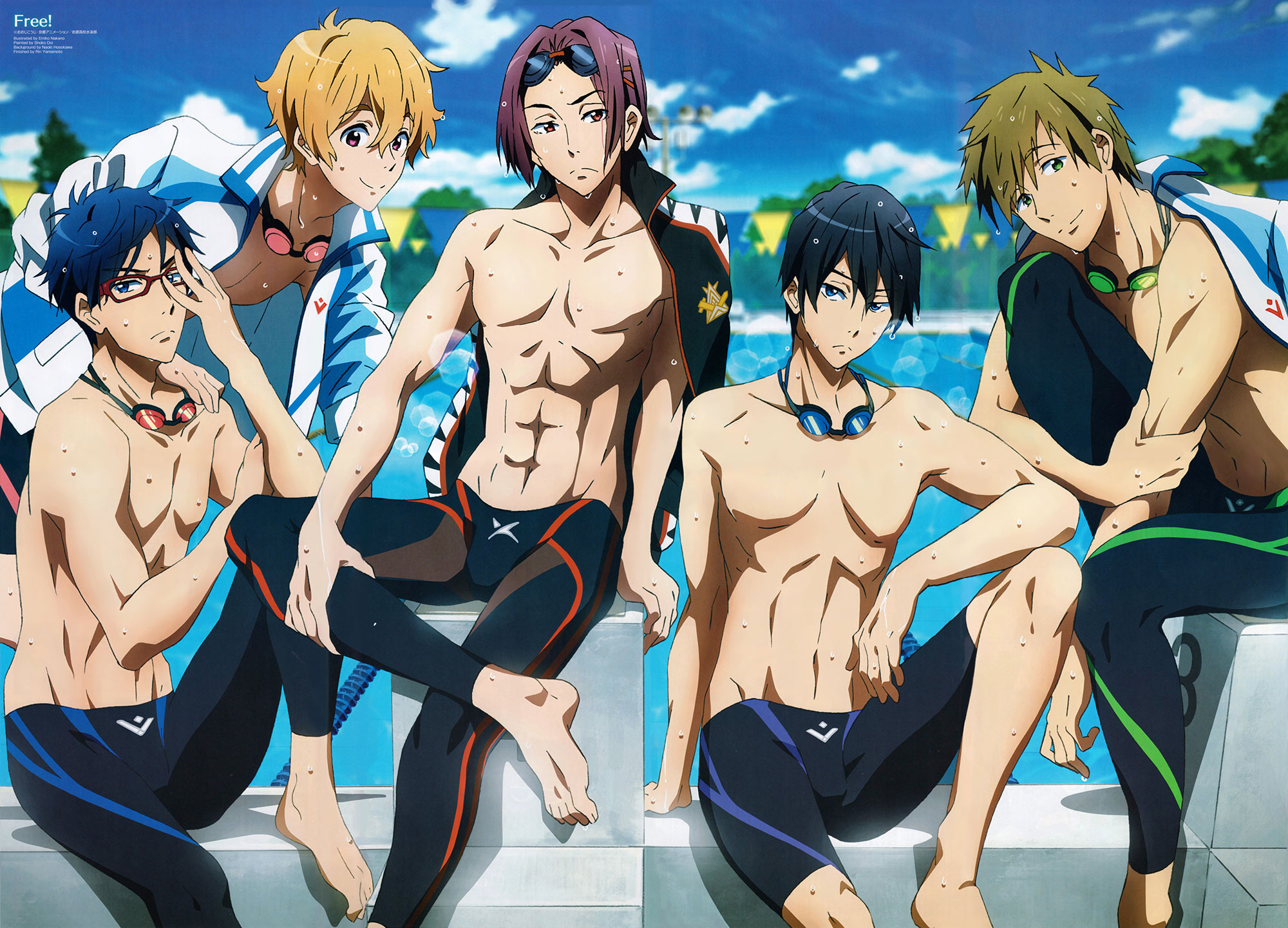
The animation displays detail in muscle alongside with hair. The colors used seem to be exotic/bright colors, similar to the process of Additive color mixing. Although vaniilya's video is sped up and she doesn't explain how to do it, the video is a good example when it comes down to the hair and color. Since a group of animators, Kyoto Animation & Animation Do, created the series; it wasn't really an independent work like Adventure Time. The animation style is going to be given a placeholder name until, something comes up.  Anime Series: Free! Animation Style: ExoticaNoJutsu Tutorial: Credit: Youtube Channel - vaniilya |
|